Capsa Mobile is a native mobile application (iOS & Android) that enables SMEs to manage invoice financing on the go; from submission to funding.
I led the design and launch of the mobile app, translating complex financial workflows from desktop into a streamlined, mobile-first experience.
Services
Company
Capsa Technology
Year
2025
Website
The Problem
Capsa’s desktop platform gave SMEs a powerful way to manage invoice financing: submitting invoices, tracking approvals and monitoring funding. But the way most SME operators actually work doesn’t look like sitting at a desk. They’re on the move, checking updates between meetings, needing to act on financing opportunities the moment they arise. The desktop-only experience created a real gap: users could see that something needed their attention, but couldn’t do anything about it until they were back at a computer.
Invoice financing is time-sensitive by nature. Delays in submission or approval can mean missing a funding window entirely. A platform that was only fully functional on desktop was, in practice, slowing down the financial decisions it was meant to accelerate.
What We Learned
Talking to SME users made one thing clear quickly: mobile wasn’t a secondary use case. Users were already on their phones checking invoice status, monitoring approvals and waiting for funding updates. They just couldn’t act on any of it. The platform had essentially trained users to be passive on mobile, when what they actually needed was to complete tasks.
The challenge wasn't building something new, it was unlocking what users were already trying to do, but couldn't finish.
Speed kept coming up as a priority. Invoice financing operates on tight windows, and users described the frustration of needing to find a laptop just to take an action that should take seconds. There was also a cognitive load problem: the desktop flows, when viewed on a phone browser, were simply overwhelming. Too much information, too many inputs, no clear hierarchy for what mattered most right now.
The Design Approach
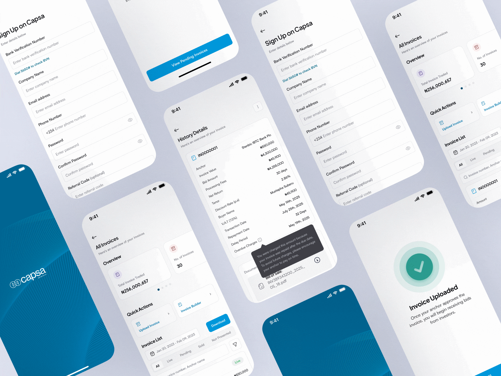
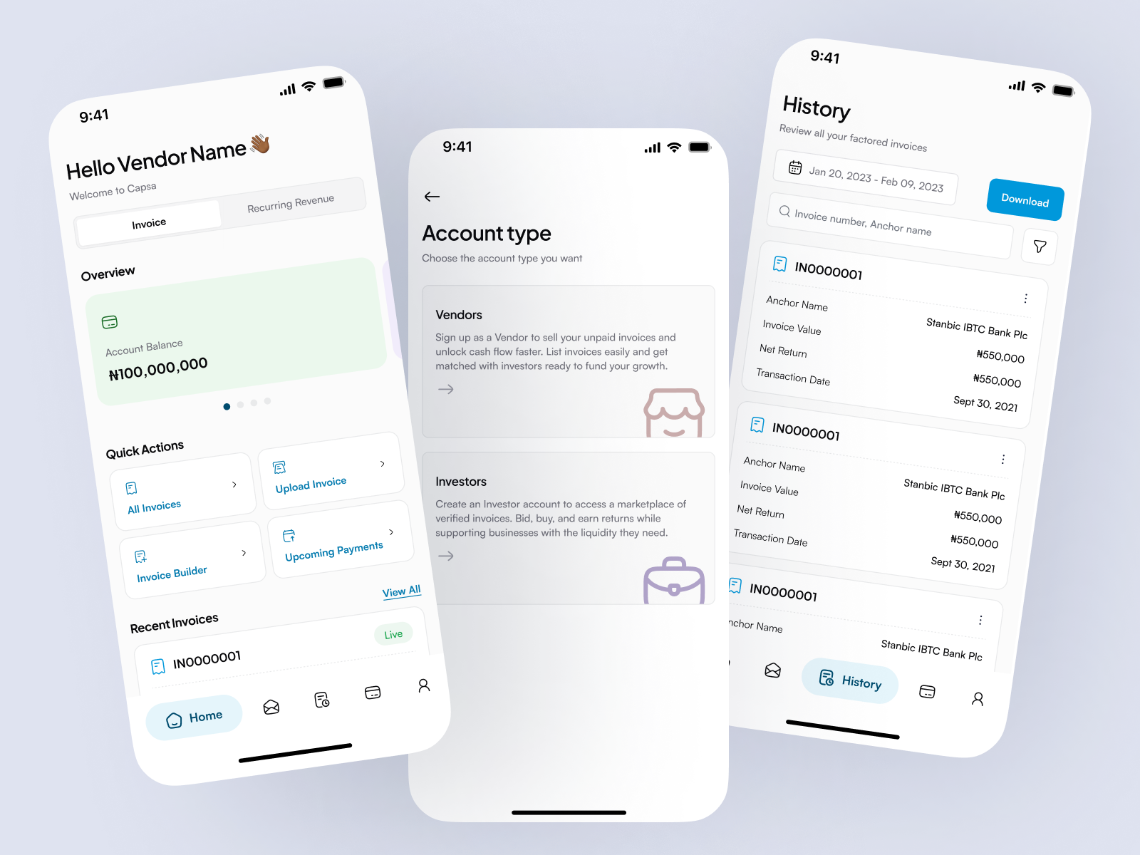
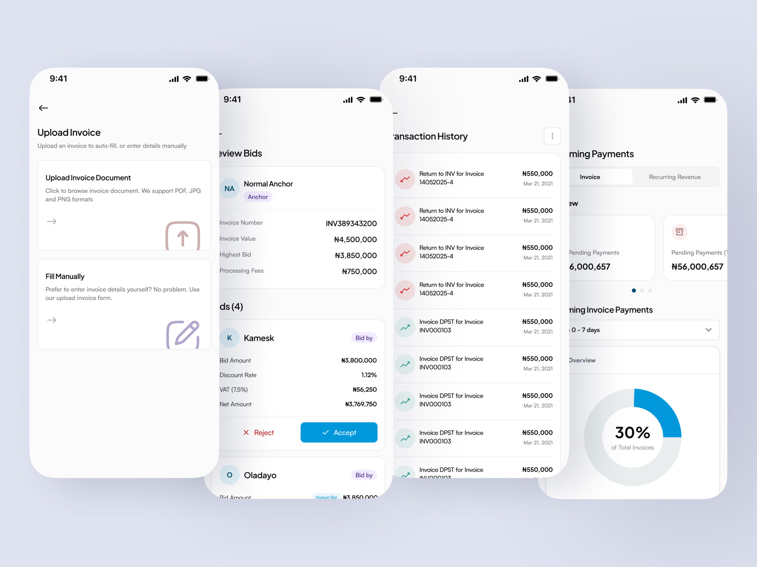
The core design principle was action-first. Rather than trying to fit the full desktop experience onto a smaller screen, I asked: what does a user actually need to do in the next 60 seconds? Everything else became secondary and accessible, but not in the way. The dashboard was built around that logic: key metrics and invoice status upfront, with deeper detail a tap away rather than all present at once.
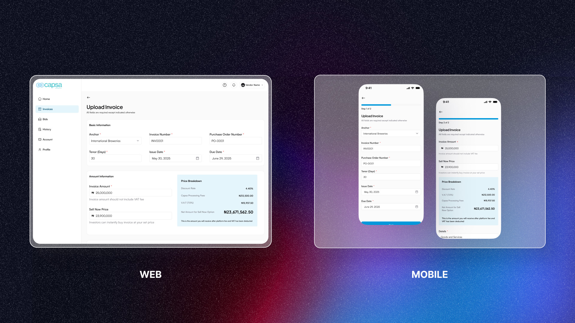
Invoice submission was one of the most complex flows to adapt. On desktop, the form was dense, necessary for compliance, but hard to process in one sitting on a phone. I broke it into shorter, focused steps with clear validation at each stage so users always knew if they’d filled something in correctly before moving on. Inputs were designed for thumb reach, and the overall number of decisions per screen was kept low.
For tracking, real-time status visibility was the priority. Users needed to know exactly where each invoice stood, not just a vague “in progress” label, but a clear stage with context about what came next. Notifications tied into this: rather than requiring users to open the app and navigate to find updates, alerts brought the relevant information to them at the moment it mattered.
Throughout, I worked from the same design system used for the web platform, adapting components rather than rebuilding them. This kept the experience consistent across surfaces and a user moving between the app and desktop would find familiar patterns, while making sure each component was optimized for touch and mobile performance.
Challenges Along the Way
The hardest design problem was the tension between simplicity and trust. Financial decisions need clarity. Users need to feel confident that what they’re seeing is accurate and complete, and that nothing important is hidden from them. But mobile screens demand restraint. Every piece of information you add competes with everything else for attention. The solution was to be deliberate about what progressive disclosure applied to: secondary details could be revealed on demand, but anything that affected a financial decision stayed visible.
Technical constraints shaped the design as well. Mobile performance mattered, slow load times on a financial app erode trust fast. Working closely with engineers early helped avoid design choices that would have been expensive to implement or slow to render. Designing lightweight interactions from the start, rather than retrofitting them later, kept the app feeling responsive.
Outcomes
The app gave SME users something they didn’t have before: the ability to manage their financing from wherever they actually were. Engagement increased among active vendors, key financial actions were completed faster, and the platform extended its reach to users who had previously been limited to desktop.
More broadly, it strengthened Capsa’s position as a platform built for how SMEs actually operate, not just how they work at a desk.
What I would do next
The most meaningful near-term improvement would be smarter notifications, ones that learn from user behaviour rather than firing on every status change. This would improve the quality of engagement rather than just the quantity.