Capsa is a fintech platform that enables businesses to unlock working capital by trading unpaid invoices and financial assets.
I led the end-to-end redesign of the Capsa platform (Capsa 2.0), focusing on simplifying onboarding, improving financial workflows, and increasing user activation across SMEs and financial institutions.
Services
Company
Capsa Technology
Year
2025
Website
The Problem
Small businesses often wait weeks, sometimes months, to get paid. Capsa exists to close that gap, letting SMEs convert unpaid invoices into immediate liquidity through a marketplace of financial institutions. The concept is powerful, but the platform wasn’t living up to it. Users were dropping off before they ever got started, and those who made it through onboarding struggled to understand what came next.
Three issues kept surfacing: a fragmented onboarding flow that gave users no clear sense of progress, financial workflows that felt opaque rather than trustworthy, and a UI so inconsistent across flows that it was hard to scale or build on.
What We Learned
The research phase confirmed what we suspected and surfaced a few things we hadn’t expected. Users weren’t dropping off because Capsa’s core offering was confusing; they were dropping off because the steps required to reach it were unclear. Many didn’t know what documents were needed, where they were in the process, or what was blocking them from moving forward.
In fintech, opacity isn't just a usability issue, it's a trust issue. If users can't see what's happening with their invoices, they stop believing the platform will actually pay out.
Financial workflows were particularly problematic. Users couldn’t track where their invoices stood in the review and funding cycle, which created anxiety and reduced engagement. The platform was asking people to put their cash flow in its hands without giving them any visibility in return.
The Design Approach
Rather than redesigning surface by surface, I structured the work around three themes: simplifying onboarding, making financial flows transparent, and building a more scalable system foundation.
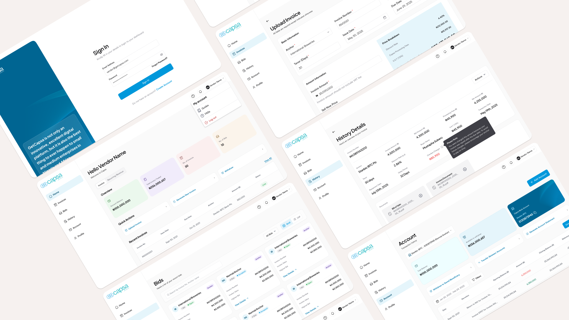
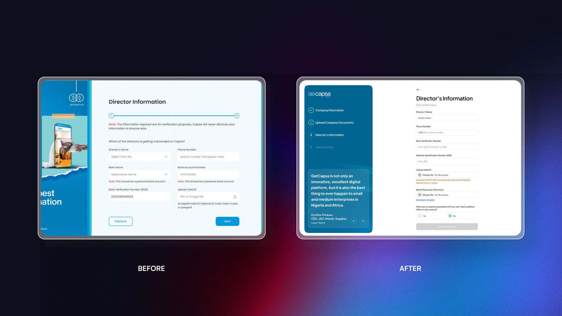
For onboarding, the key change was progressive disclosure: breaking a dense, all-at-once flow into guided steps with clear progress cues. We deferred non-critical inputs to reduce cognitive load early, and grouped related fields so each step felt purposeful rather than arbitrary. Users could finally see where they were, what was left, and what they needed to prepare.
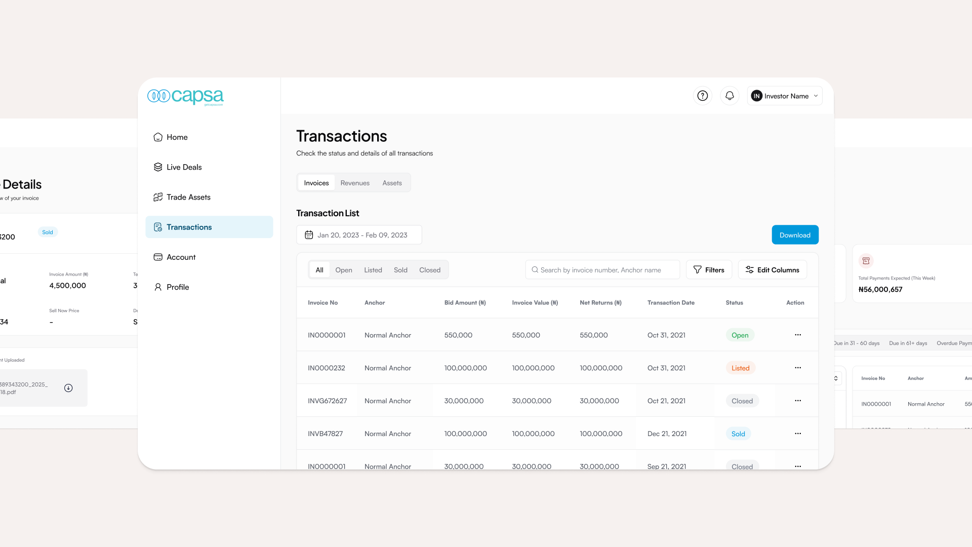
The invoice and funding flows got a similar treatment. We visualized the full lifecycle: submission, review, approval, funding, so users always knew where their invoice stood. Real-time status updates meant that instead of wondering if anything was happening, users could see it. This wasn’t just a usability improvement; it directly addressed the trust problem that research had flagged.
On the system side, I worked to standardize components and reusable patterns across the platform. Inconsistency had been making the product feel unreliable and creating unnecessary overhead for the engineering team. A more cohesive system made the product easier to use, easier to build on, and easier to extend as the company grew.
Challenges Along the Way
The biggest tension was between simplicity and compliance. Fintech is a context where you genuinely can’t cut corners on data collection, as there are regulatory and risk requirements that demand detail. The challenge was deciding what had to happen upfront and what could be deferred, and then designing around that distinction without making users feel like they were navigating a bureaucratic form.
Aligning stakeholders was the other ongoing challenge. Risk, product, and engineering teams each had different priorities, and fintech decisions carry real consequences if they go wrong. I used workshops and user research to keep conversations grounded as it is easier to agree on what users actually need than to negotiate between internal preferences.
Outcomes
The redesign produced measurable results: a 38% increase in onboarding completion, faster activation for new users, and 24% growth in funding volume. More qualitatively, users reported greater confidence in the platform, a better understanding of what was happening with their invoices, and greater trust in the process.
What I would do next
There’s more to explore. Better drop-off analytics would help identify exactly where users are still getting stuck. And automating parts of invoice verification could meaningfully shorten the time between submission and funding.