I led the design of a unified digital ecosystem for a large teaching hospital, covering: internal operations (ERP system), public-facing website and internet access & authentication portal.
The goal was to streamline hospital workflows, improve patient access to information, and modernize digital infrastructure across the organization.
Services
Company
University College Hospital, Ibadan
Year
2023
Website
The Problem
University College Hospital had a fragmentation problem. Staff navigated manual, inconsistent internal tools. Patients encountered a public website that was hard to use and harder to trust. Visitors and staff trying to get online faced a login portal that was confusing and slow. None of these systems talked to each other. They didn’t look alike, didn’t feel alike, and had each accumulated their own set of usability problems independently.
The result was friction at nearly every touchpoint: delayed internal processes, patients struggling to find basic information, and daily frustration for the people using the network access system. Each system had its own issues, but the deeper problem was that they had never been designed as a connected whole.
My Role
I led design across all three systems: the internal ERP, the public-facing website, and the internet access portal. That meant running stakeholder interviews across departments, defining the overall UX strategy and system architecture, and designing the workflows, interfaces, and interaction patterns for each product. I worked closely with engineers and institutional stakeholders throughout, managing the complexity of an environment where decisions affected staff, patients, students, and visitors all at once.
The Design Approach
The temptation with a project this broad is to treat each system as a separate engagement. I took the opposite approach: before designing anything, I established a shared set of principles that would hold across all three products. Users, whether a staff logging into the ERP or a patient looking up clinic hours, should never feel like they’re using systems built by different teams. Consistency wasn’t just a visual goal; it was a functional one.
That meant defining role-based experiences early. A staff member’s needs in any given system are fundamentally different from a patient’s or a visitor’s. Designing for those distinctions from the start rather than building a generic interface and hoping different users would adapt, shaped every subsequent decision.
The real design challenge wasn't any individual screen. It was making three disconnected systems feel like one coherent institution
The Three Systems
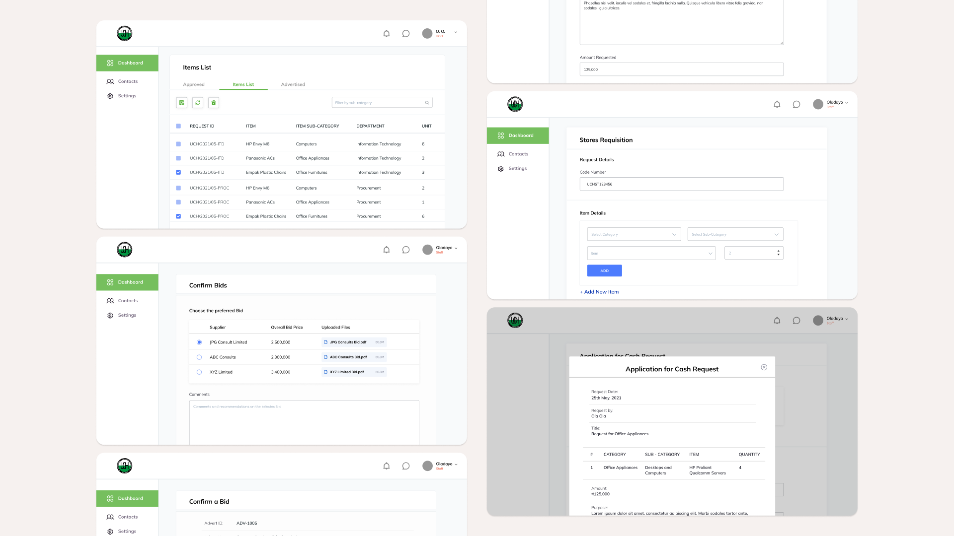
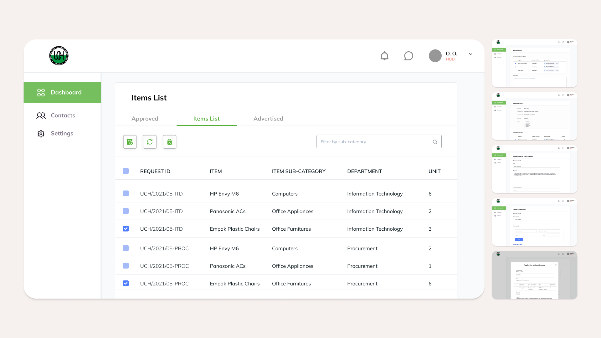
System 1 – Internal ERP
The ERP was the most operationally complex of the three. Administrative staff were working around manual processes and inconsistent tools, creating bottlenecks in workflows that had real consequences. Delayed billing, fragmented patient records, slow cross-department coordination. The redesign introduced role-based dashboards tailored to how different staff actually worked, a structured patient management system, and clear billing and records workflows. The goal was to make the software fit the work, rather than requiring staff to adapt their work to the software.
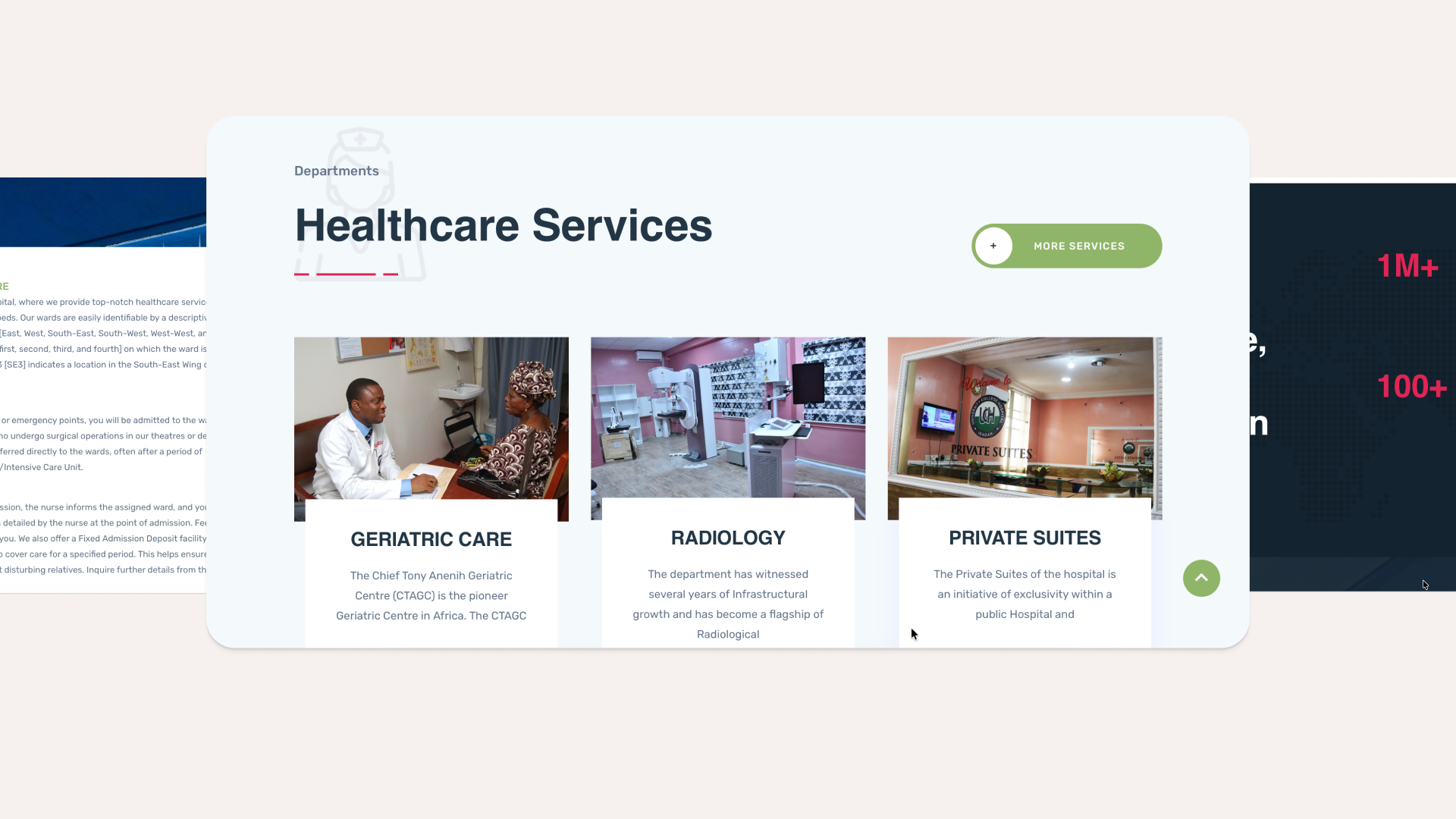
System 2 – Public Website
The hospital’s public website was where patients came to understand their care options — and it was failing them. Navigation was unclear, the information architecture didn’t reflect how patients actually looked for services, and the visual design felt dated in a way that undermined confidence. The redesign focused on clarity first: restructuring the site’s information architecture around patient needs, creating a clean navigation hierarchy, and making contact information and service guidance genuinely easy to find. The updated design was accessible, mobile-responsive, and built to accommodate the range of people who depend on it: from patients researching a first appointment to families looking for ward information quickly.
System 3 – Internet Login Portal
The login portal was the most underestimated of the three systems and in some ways the most important to get right. It’s the first digital interaction many staff, students, and visitors have with the hospital’s infrastructure, and the old experience was slow, confusing, and prone to errors. The redesign simplified the authentication flow significantly: fewer steps, clearer instructions, better feedback for errors and connection states, and session handling optimised for the reality of how people use hospital Wi-Fi, frequently, across long shifts or visits, often in a hurry. A smoother login experience is a small thing individually, but multiplied across thousands of daily interactions it makes a meaningful difference.